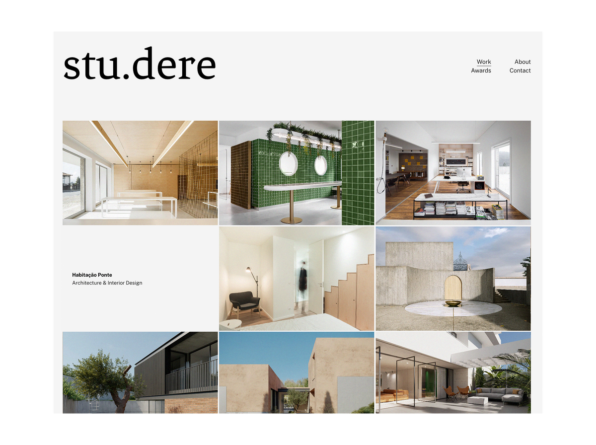
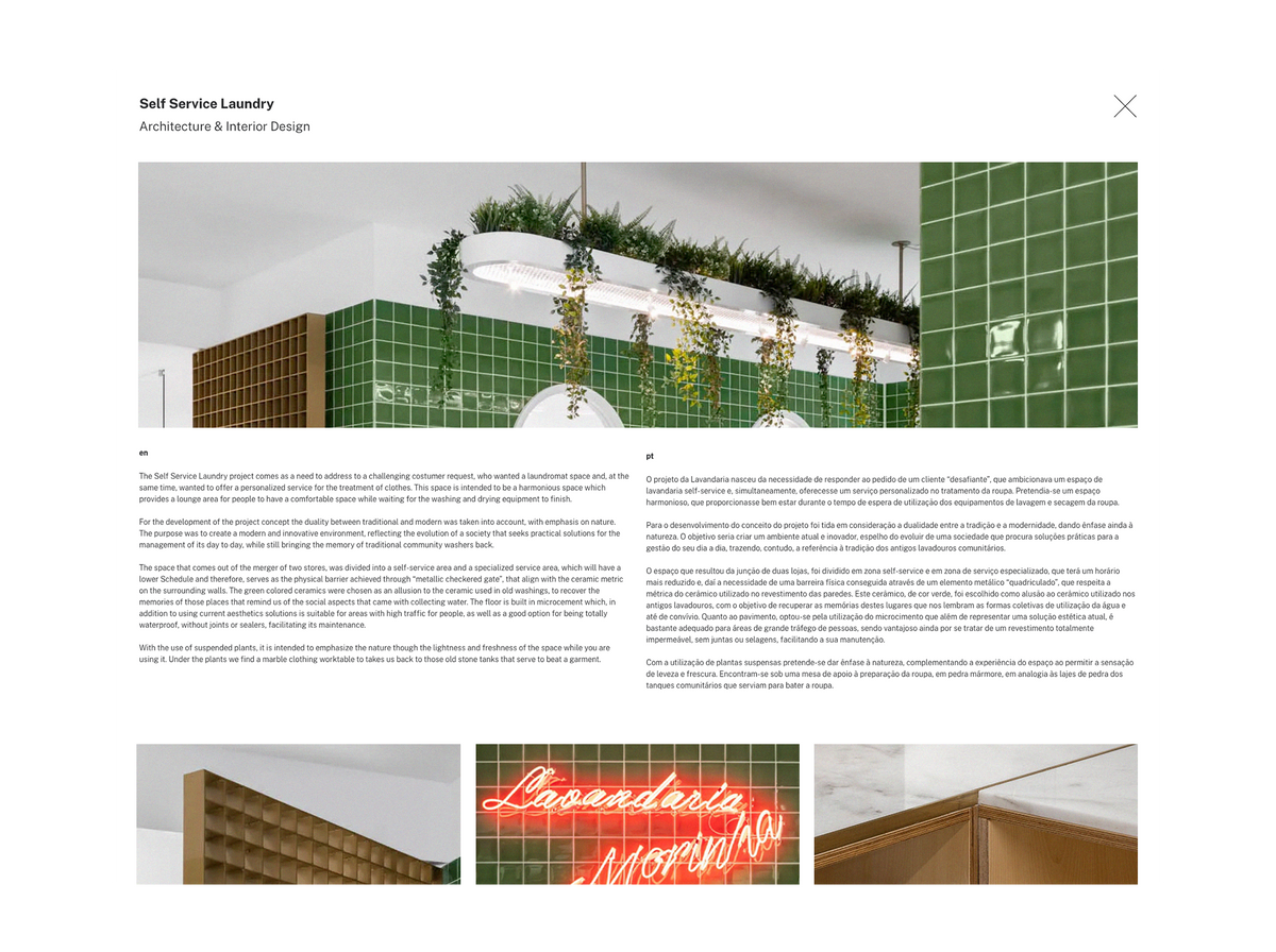
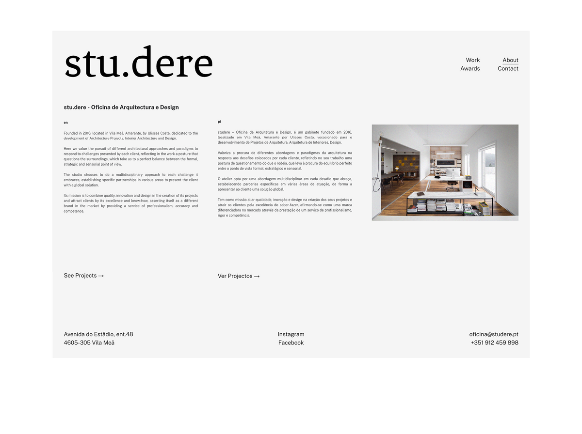
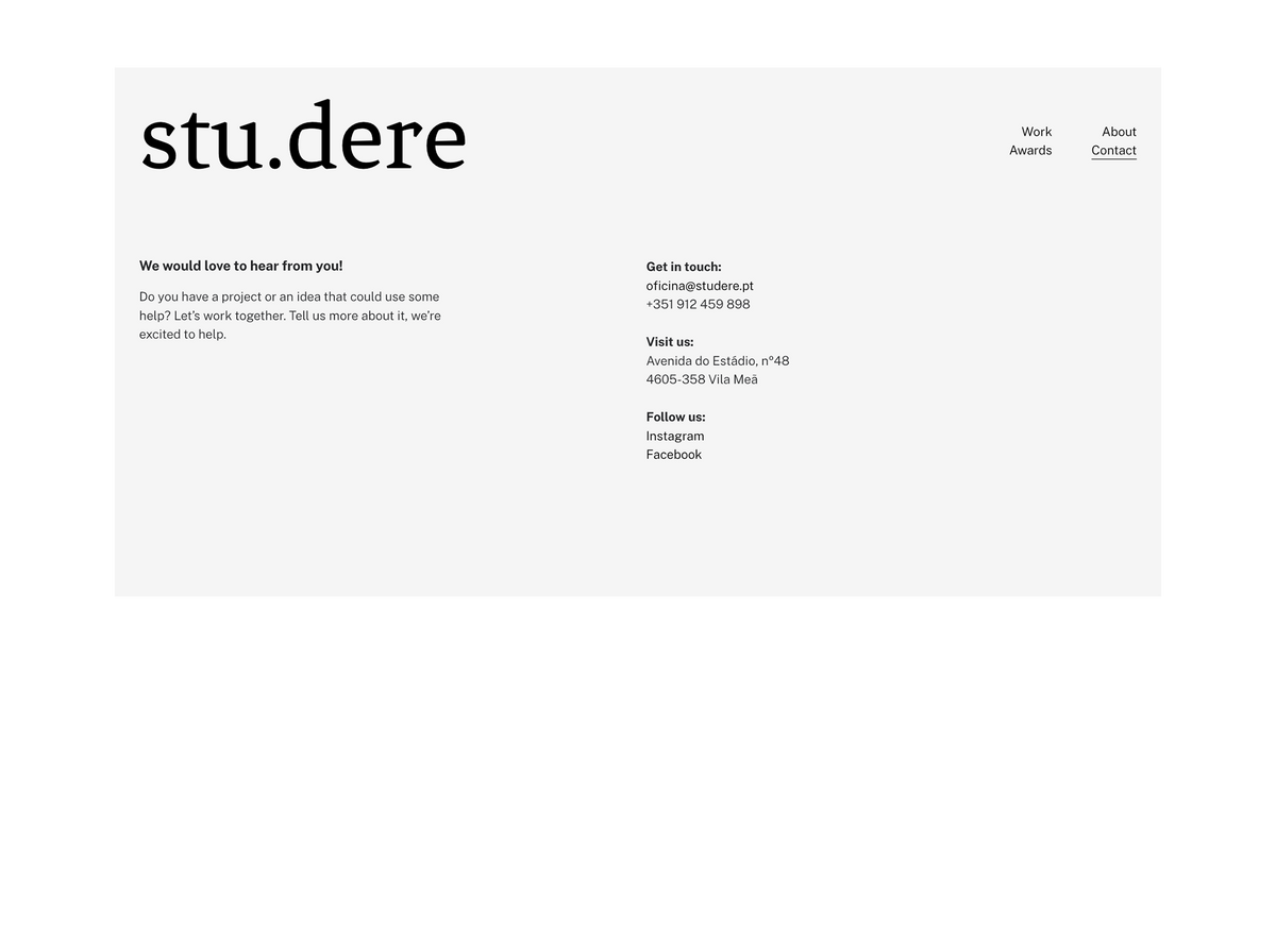
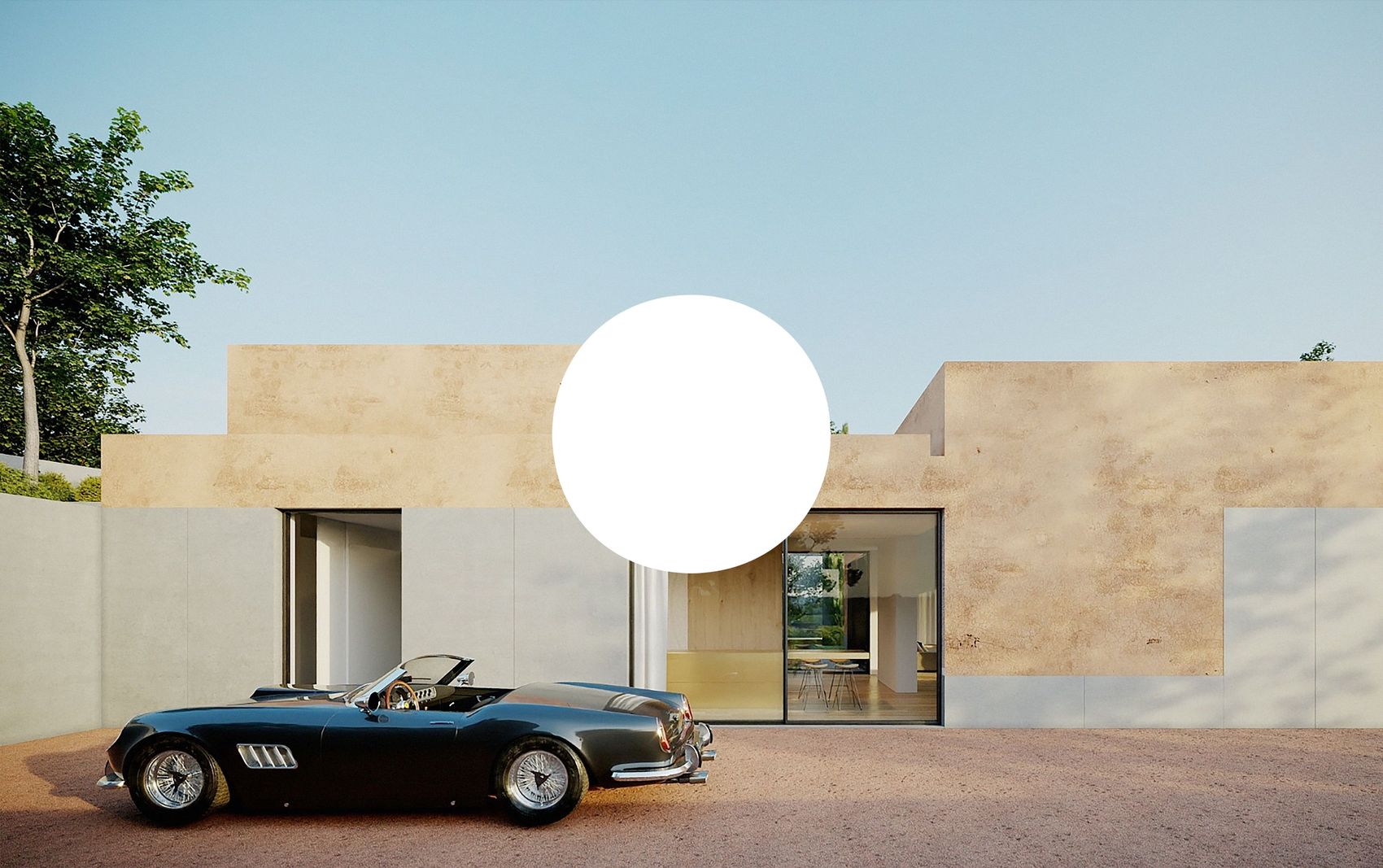
Stu.dere is a Portuguese architecture studio founded in 2016, that invited us to develop its brand identity and website. Before diving into the project, we immersed ourselves in Stu.dere's brand values, market, and user experience. This way it was possible to determine the right direction to establish a better connection with their customers.
Our starting point was to understand the meaning of the word “Studere”. Firstly introduced by the Romans, it means disciples but it can also mean that a student strives and put all his effort to achieve his goal. Understanding that concept helped us develop the brand identity.
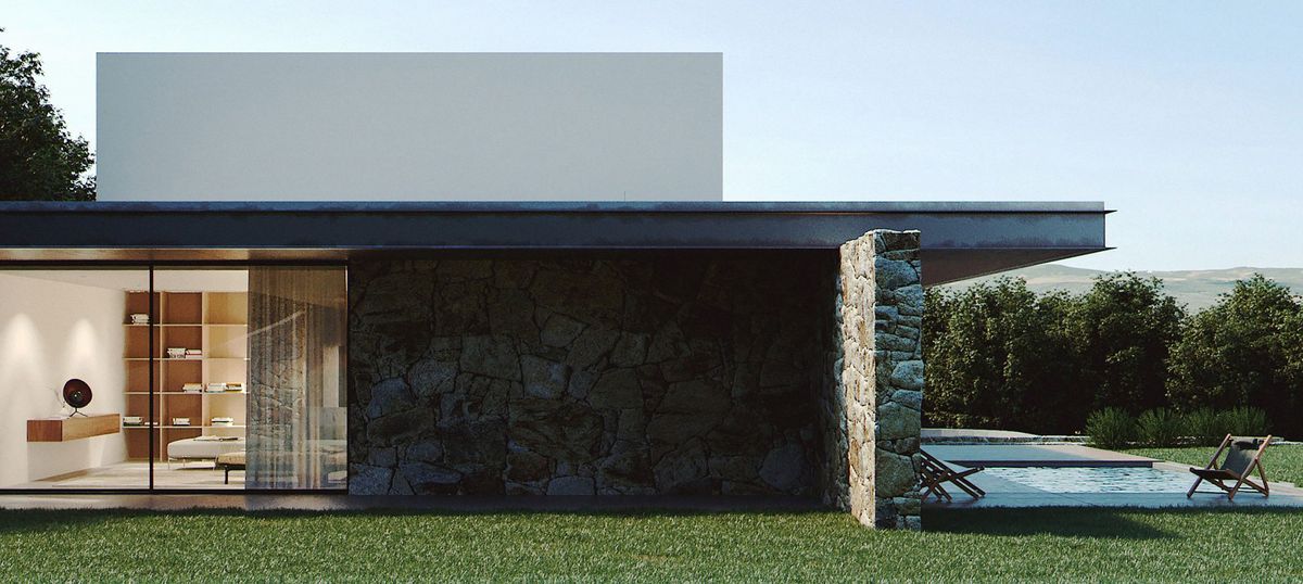
A different brand in the market by providing a service of professionalism, accuracy, and competence.

We decided to focus on a simple dot. Like a full stop that means the end of a sentence, in this case, it represents the achievement of the disciple to its objectives. It also expresses the beginning of new paths and goals.
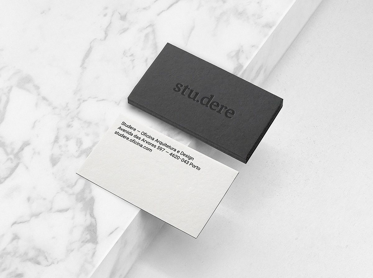
The colors black and white represent the opposites, the end, and the beginning. The typeface is also inspired by the Roman typefaces but with a contemporary touch.
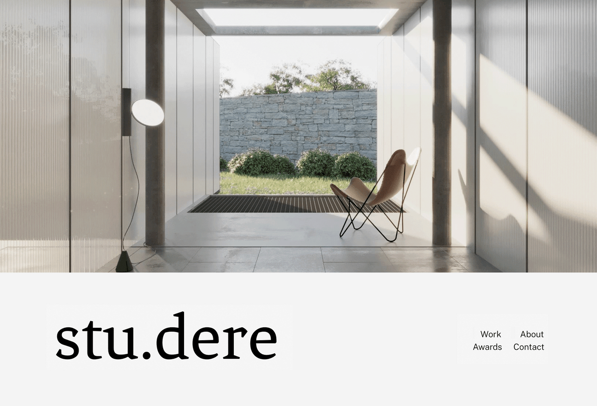
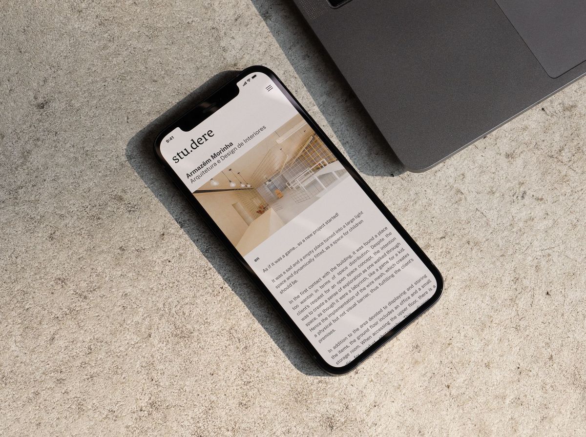
We connected the brand to its background. We refined Stud.ere’s brand identity by aligning it with its values, re-imagined the visual system and website in a disruptive and contemporary way.
